Understanding Colour Theory
Re-emerged from the noughties and populating today's style discussions, colour seasons have had a rebirth of interest. If colour theory has you intrigued or you want to learn how to utilise colours that work best for you, read on as we delve into the fascinating concept of colour theory and how seasons come into play.
QUICK LINKS
- What is Colour Theory?
- How Do I Find Out my 'Colour Season'?
- The Different Seasons
- Shop by Season
- How to Use Colour Theory to Style Accessories
What is Colour Theory?
Colour theory is not just a concept exclusive to artists and designers; it's a fundamental principle that influences our daily lives more than we realise. At its core, colour theory is the study of how different colours interact with one another and how they affect our emotions and perceptions.
The concept of colour and its study can be traced as far back as the teachings of ancient Egyptian and Greek philosophers like Aristotle and Plato, who pondered the nature of colour and its perception. However, it was not until the Renaissance period in the 15th century that colour theory began to take a more systematic and scientific shape. Artists such as Leonardo da Vinci and Leon Battista Alberti made significant contributions to understanding colour in terms of light and pigments.
In the 18th century, Sir Isaac Newton conducted ground-breaking experiments with prisms, demonstrating that white light could be broken down into a spectrum of colours. This laid the foundation for modern colour theory, further developed by artists and scientists like Johann Wolfgang von Goethe and Albert H. Munsell in the 19th and 20th centuries. Today, colour theory is a fundamental aspect of art, design, psychology, and various scientific disciplines, influencing how we perceive and interact with the world around us.

Do I need to know Colour Theory?
If you find yourself with a number of clothes that are hardly ever worn, they don't look quite right on you but you can't put your finger on why, it may be that they don't fit your colour season. Identifying what colours work best for you can help you to become a much more confident, considered and effective shopper.
Additionally, learning about colour theory can help you pull new combinations of clothes together, once you have a good understanding of how the colours will interact with each other.
How Do I Find Out my 'Colour Season'?
There are a handful of quick tips to help you identify which colour season you fall into.
Firstly, identify your skin undertones. This isn't to be confused with the depth of your skin tone, instead, you're looking for the presence of pink/cool tones or golden/warm tones. A few tips to help identify your tone:
- If your wrist veins appear blue/purple then you'll be cool-toned. If they look greener, you're warmed-toned.
- If you prefer to wear gold jewellery, you may be warm-toned. Conversely, people who are cool-toned will prefer to wear silver jewellery.
Secondly, identify your 'intensity'. The seasons are split into high and low intensity. Winter and spring represent high-intensity colours and autumn and summer are low-intensity - you can think of this as the difference between bolder colours and more muted colours. Typically, if you have a darker hair colour or complexion, the higher-intensity colours will suit you best, and vice versa.
However, a more straightforward way to identify your season is to simply try on different clothes and see which ones look best on you.

Ultimately, the simplest way to identify your season is by allowing your existing wardrobe to guide you. For example, if your favourite shirt to wear is a powder blue and you struggle to ever get on with a yellow tie, you may be a 'summer'.
The Different Seasons
The colour seasons are built around the colours which you would typically see at that time of the year. Spring is bright and fresh with poppy reds, fresh greens, and warm corals. Summer is cool and soft, with icy blues, soft purples, and pastel hues. Autumn colours are burnt oranges, rustic reds, and mossy greens. Lastly, winter is deep jewel tones like sapphire, emerald, and ruby red.
You'll notice core colours, like blue, are present in each season but in different tones and depths. Meaning that we can all wear (almost) any colour, just with the right tweak of shade to make it suit us.

Do I need to stick to my 'colour season'?
In short, no. A good understanding of colour theory can certainly help you curate a wardrobe of looks that complement each other as well as yourself, but like all style rules, it's made to be broken. For example, if your favourite colour sits outside of your 'season' that's not a reason to avoid it.
How to break the rules, carefully
Firstly, you can stray from your season without technically breaking the colour wheel rules as there are multiple layers to them. For example, you can look to stay on the same half of the wheel and just shift intensities, as you know you're still complementing your undertones.
Secondly, you may find that you can wear clothes on the opposite side of the colour wheel, as contrasting colours can still look visually harmonising. For example, summers can wear spring colours and vice versa.
Thirdly, you needn't worry about small accessories or clothes that are far away from the face, like trousers, as there won't be a strong visual link between them and your face.
Lastly, many people have neutral undertones, an even balance of pink and yellow to their skin without one dominant tone, this means that the colour wheel is much more open to them as they'll suit both warm and cool tones.
SHOP BY SEASON
Spring


Autumn


Summer


Winter


How to Use Colour Theory to Style Accessories
Classic Colour Combinations
There are some classic colour combinations when pairing your pocket square with your jacket colour that will always look immaculate. But why do some colour combinations look more harmonious than others? This is explained by colour theory, where particular colours are more complementary to each other and are therefore more pleasing to the eye.
Utilising the colour wheel, there are some basic rules to follow that will ensure your outfit always looks harmonious. Below we've paired some of our pocket squares with some classic jacket colours to illustrate the theory.
Contrasting Colours
Utilising contrasting colours creates striking combinations, where any two colours on opposite sides of the colour wheel (ignoring seasons) create a high contrast. Usually, one colour forms the base, while its contrasting colour provides the accent.
Taking a classic navy jacket, any pocket square with a shade of yellow will always look striking. It's the direct contrast that really makes the magic happen. In the same way, a navy pocket square will work wonderfully with any golden-toned jacket like our Tawny Brown Glen Check Jacket.
Styling a Pocket Yellow Square: The Palace Guard
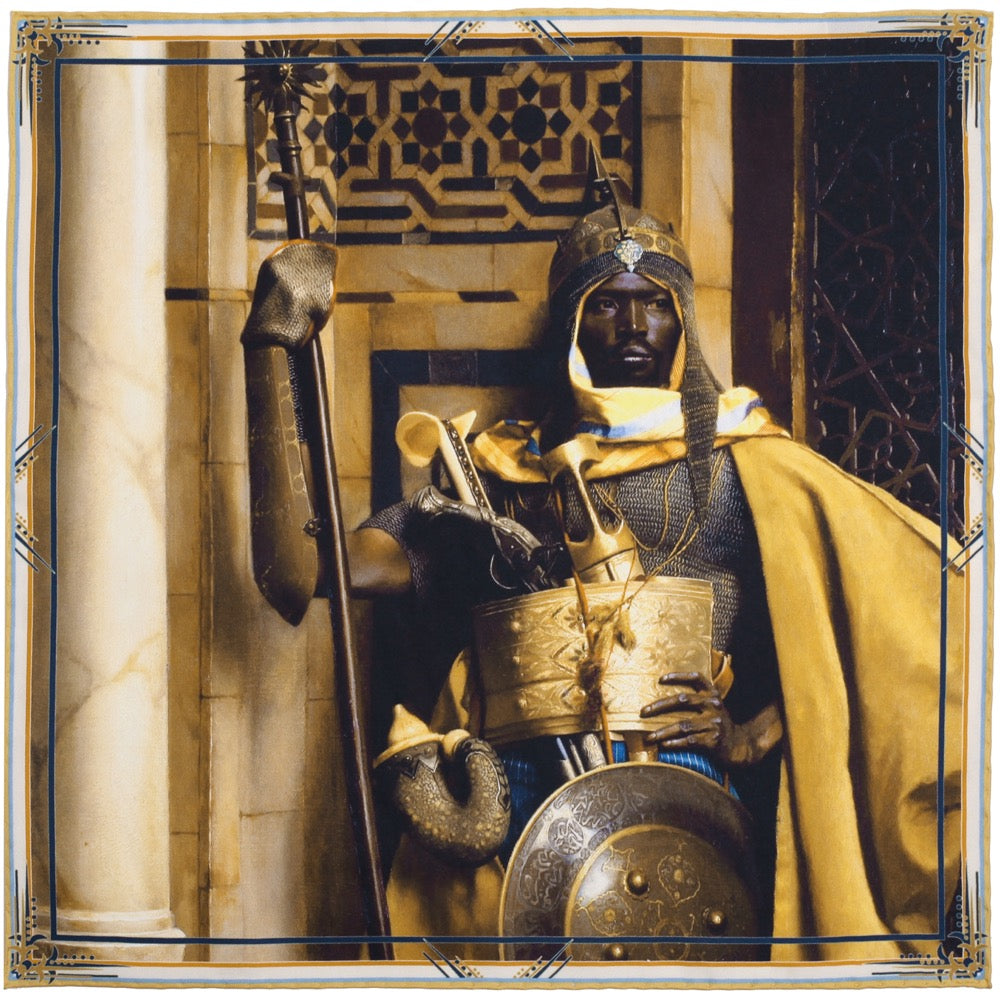

A variation that is also a classic combination with navy is pairing with burgundy/red/burnt orange as they are adjacent to yellow on the opposite side of the colour wheel, and also produce a high contrast that pairs beautifully with the dark blue navy hues.
Styling a Red or Burgundy Pocket Square: City Of New York


Monochromatic
A monochromatic look is possibly the most effortless style to pull off and is simply taking different shades of the same colour, for instance using both a burgundy tie and pocket square. It is more muted than wearing contrasting colours but always looks stylish.
Styling a Blue Pocket Square: Long Live Victoria


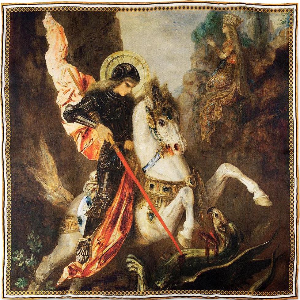
Analogous
Colours that sit beside each other on the colour wheel form an analogous relationship. In the example below shades of reds, oranges and just a hint of yellow harmonise beautifully.
Styling a Warm-Toned Pocket Square: Saint George & The Dragon By Moreau

Black and White
You may be wondering why there are no blacks or whites on the colour wheel. That's because they're not technically colours and would sit at the centre of the wheel. Blacks provide shades when mixed with colours, while whites provide tints.
What this does mean is when you a pairing either a very dark or a very lightly coloured jacket you really are working with a blank canvas. A good rule of thumb is to choose brighter vibrant colours in summer and more muted, earthy colours in winter, but it comes down to personal choice, you can't really go wrong!
The tuxedo below looks brilliant when paired with the red accent. For black tie events as long as you're wearing a black bow tie, you can be bold with your colour choices.